Philippines In The Packaging
By Angelo Comsti
March 28, 2022

Packaging is a useful and effective instrument to establish and strengthen one’s brand identity.
For one, it differentiates the brand from the other players in the field. Clearly, Godiva isn’t Snickers because it’s more luxurious based on the way it’s presented and contained. Apart from market positioning, it also speaks of the brand’s values, which inevitably allows the consumer to determine whether he is aligned with it or not.
Masa Bakery Manila and Agimat Gin both wanted their packaging to pay tribute to the roots of their products, and so they used elements that make up the Philippines when designing their packaging. The results are stunning visuals that make the brands not only stand out from the pack but promote a sense of local pride as well.
Masa Bakery Manila is a panaderia started by Chris Cuasay in 2007. With no background or experience in baking, she researched and studied about the techniques and recipes in making breads from the bakeries her generation grew up with, like pan de coco, Spanish bread and kalihim.
Their initial packaging has greatly evolved to what it is now. What once was a plain brown box with a logo sticker at the centre has transformed into a more colourful one once Cuasay discovered that her customers like giving away her products as pasalubong (souvenir). “They began to order to send as gifts so I thought it would be best to improve our packaging to attract more attention,” she says.
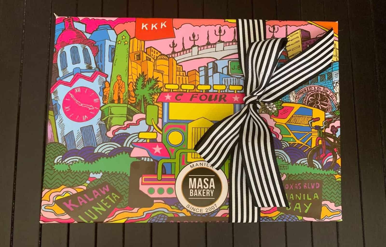
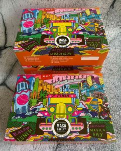
She collaborated with local artist Bryan Yabut to come up with a box that delivered in function as well as commemorate the place where they first started, which is in Ermita. The bright and flashy artwork makes you pause to appreciate and identify Manila’s famous landmarks, which includes the Rizal Memorial, Manila Clock Tower, The Manila Cathedral, and the Jones Bridge.
“We also put many other things that are part of the Philippines’ history such as sampaguita, our national flower, the KKK red flag, a pedicab, the iconic jeepney, and the streets of Jorge Bocobo in Ermita, which has been our home for 13 years,” Cuasay adds.
Mixologist Kalel Demetrio also worked closely with someone to come up with a stark design for his Agimat Gin, which is concocted using ingredients from the three major islands of the country—ylang ylang and wild floral honey from Luzon, yutukon and libas fruit from Visayas, and biasong and pink pomelo from Mindanao.

Unlike Chris, he didn’t need to look far for an artist. He simply turned to his business partner Tyson Branz who has an eye for design.
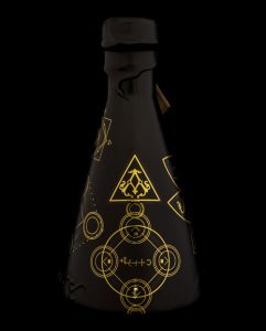
They both wanted the bottle to represent their Agimat Foraging Bar and Kitchen in Poblacion, Makati, which is adorned with natural elements and items like amulets that suggest sorcery. They began the process by zeroing in on a conical flask for the bottle as it is shaped like their logo and also relates to a laboratory. They had it wrapped in a black matte finish that so that the baybayin or pre-Hispanic Philippine script written in gold, the typical color of a talisman, will stick out. A pendant tied on the neck of the bottle indicates the batch number of the gin and completes the sleek look.
There’s a lot of story found in the packaging of Masa Bakery Manila and Agimat Gin that even before you consume the product itself, you’ll be satiated with Filipino pride.


